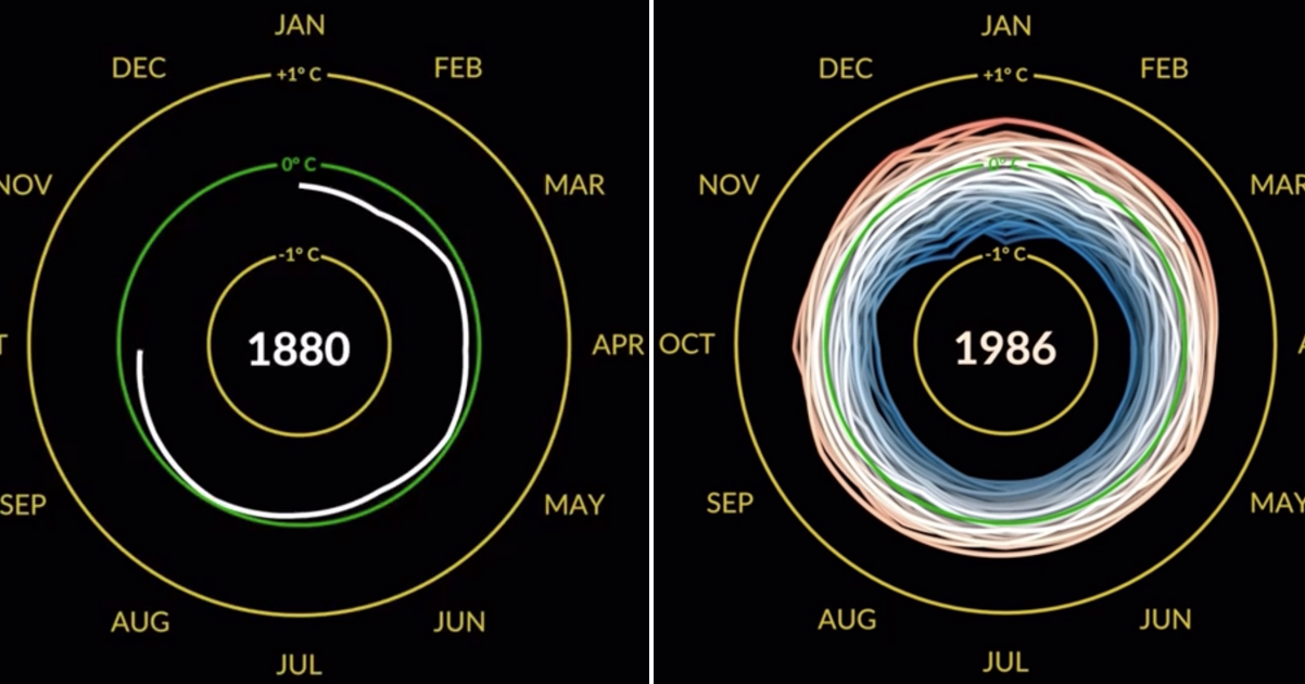
This NASA visualisation of monthly global temperature anomalies is beautifully done (and predictably grim)

Not now, global warming! Just because there wasn’t enough to keep you awake at night right now, this NASA visualisation of monthly global temperature anomalies has just gone viral on Reddit.
Unfortunately there’s no unexpected plot twist.
And just a few of the comments it prompted.
‘Exceptionally good method to communicate huge amount of data…relatively speaking.’
ieatmypeaswithhoney‘You could see something from the 1883 krakatoa eruption. Was said to have lowered global temperatures by over 2 degrees.’
Lowasasnakesbelly‘Genuine question, how legit is the global temperature data taken as far back as 1880? I dont expect any major changes as such but still interesting to know how they got data point averages at a global scale back then.’
vatsbuts‘Global temperature data started being successfully collected in the 1850s, using thermometers. Prior to that there hadn’t been much of a systemic effort to keep temperature records, but as of the early 1800s-1850s, we had begun in most countries to keep routine weather recordings. If you look at temperature data, it all starts around this period, because it’s the first period in which we got consistent global coverage.’
InterlocutorX‘This is a fascinating visual 😳.’
weaktoast
READ MORE
Ryan Reynolds had the best response to this story of an everyday celebrity encounter
Source Reddit u/thepositivepandemic