A teacher annotated Boris Johnson’s confusing Covid-19 graphic and it’s brilliant

You’ll know by now that the government’s new Covid-19 guidelines have been criticised as everything from ever so slightly confusing to utterly baffling.
The stream of nonsensical graphics being put out by the government hasn’t helped, including this one.
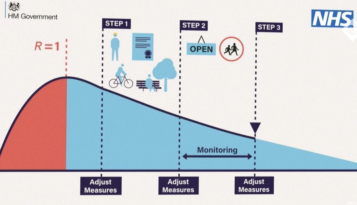
Now a teacher has done a fantastic job of annotating it and it’s very funny and totally spot-on.
‘From schoolteacher friend,’ wrote @trishgreenhalgh on Twitter.
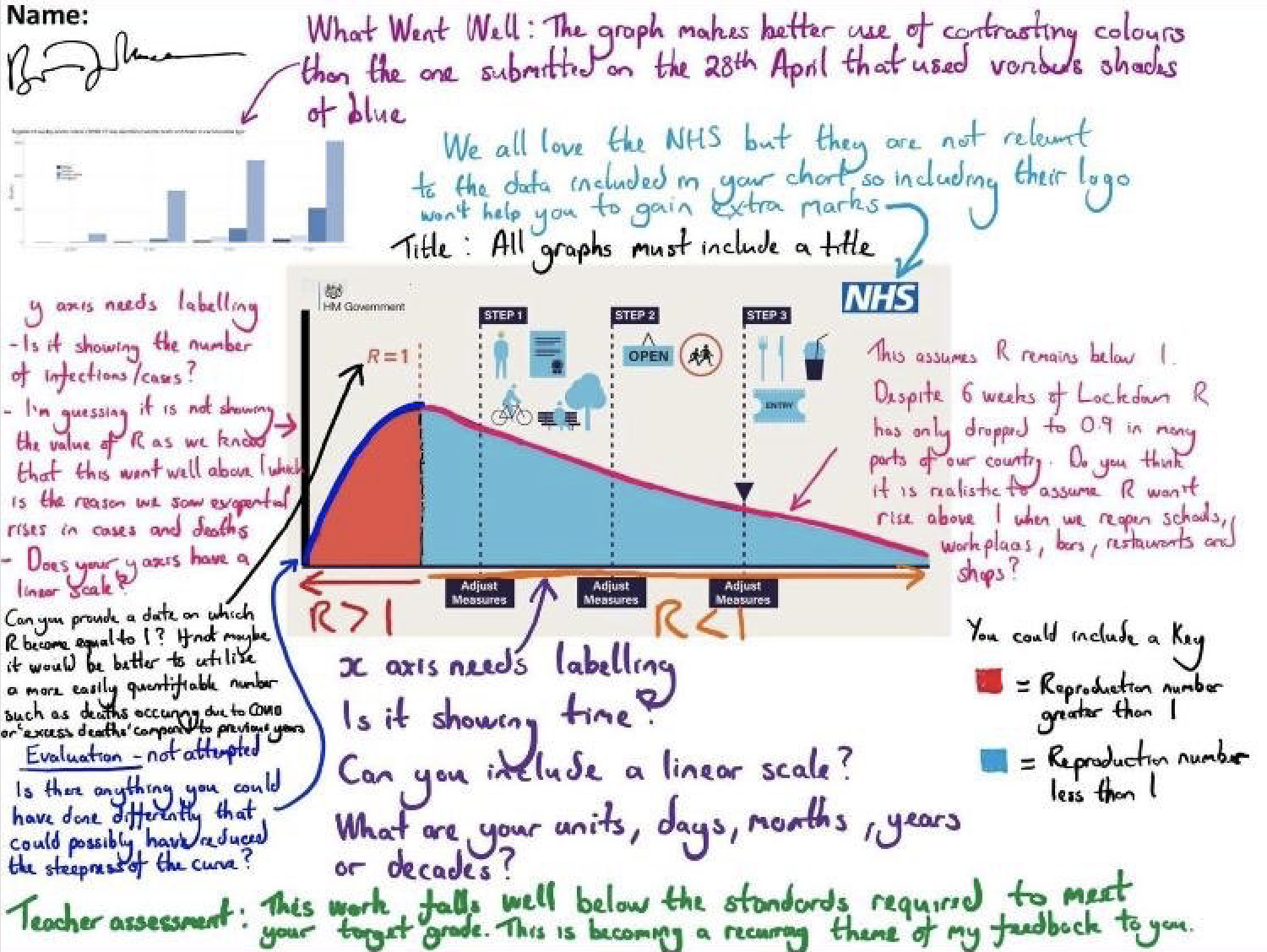
You’ll probably have to zoom in to properly enjoy it, but here are a few highlights.
‘Title: All graphs must include a title’
‘We all love the NHS but they are not relevant to the data included in your chart so including their logo won’t help you to gain extra marks’
‘x axis needs labelling. Is it showing time? Can you include a linear scale? What are your units – days, months, years or decades?’
‘You could include a key’
‘y axis needs labelling …’
‘Evaluation – not attempted. Is there anything you could have done differently that could possibly have reduced the steepness of the curve?’
‘Can you provide a date on which R became equal to 1? If not maybe it would be better to utilise a more easily quantifiable number …’
‘What Went Well: The graph makes better use of contrasting colours than the one submitted on 28th April that used various shades of blue’
And finally, the overall teacher assessment.
‘This work falls well below the standards required to meet your target grade. This is becoming a recurring theme of my feedback to you.’
Beautifully done.
And just in case you were still confused, doctor turned author and comedian Adam Kay was here to help.
OK, for clarity. The R0 is somewhere in the range of 0.5-0.9 and the number of infections with COVID-19 in the UK is 219,183. So the COVID Alert Level is somewhere between 219,183.5 and 219,183.9. pic.twitter.com/bhRZwCjg2f
— Adam Kay (@amateuradam) May 10, 2020
READ MORE
10 reasons why “good British common sense” might not be the best Covid-19 strategy
Source @trishgreenhalgh