These graphics really brings home the scale of the fires burning in Australia right now

It can be hard to get your head around the scale of the bushfires raging in Australia right now.
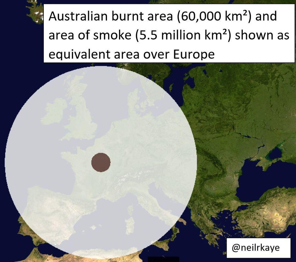
This graphic by @neilrkaye, a climate data scientist at the Met Office, shows the area that has so far been burnt – and the smoke it has generated – over a map of Europe and it really does leave you in no doubt.
‘The area of ground burnt in Australia is 60,000 km² and the smoke covers a truly enormous area of 5.5 million km². This is what this would look like over Europe,’ says Neil.
Not by Neil, but this graphic does something similar, except with the US.
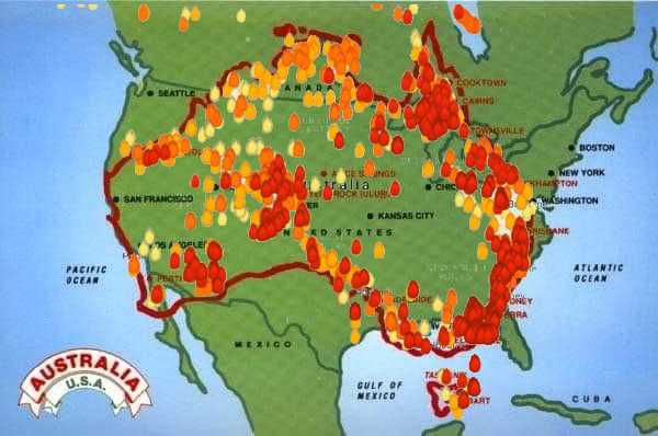
(via Reddit u/Hmmmm_Interesting)
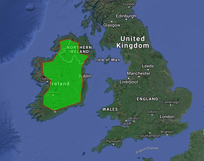
And Ireland.
‘Area of land burnt in Australia compared to the size of Ireland’
And you can follow @neilrkaye on Twitter here.
READ MORE