15 pandemic-related items that should have been designed a lot better

You’d think that the threat of a deadly virus would really focus people’s minds when they’re designing stuff to help combat it, but that’s not always the case.
The clever lot over at someecards.com have gathered some fine examples of people just not thinking this through.
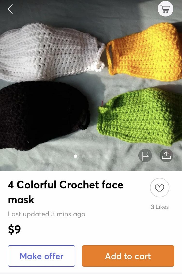
1. A crocheted face mask
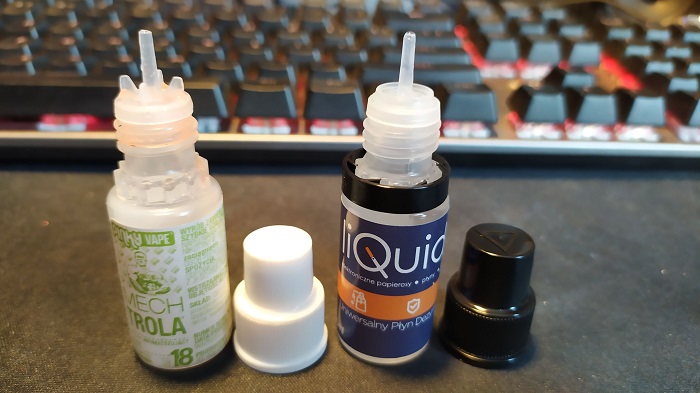
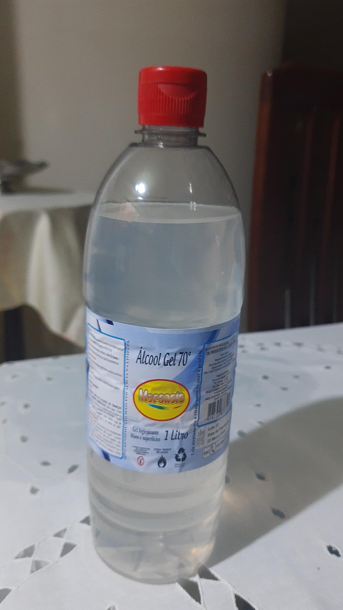
2. Hand sanitiser that looks like vape liquid
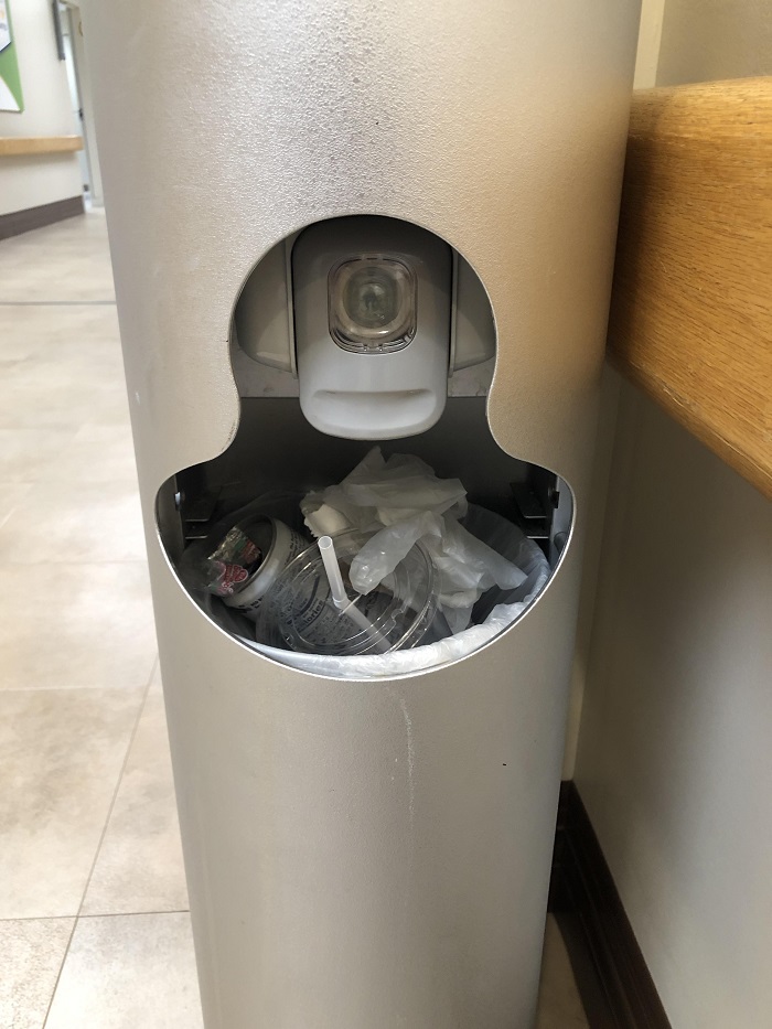
3. Hand sanitiser just inches from rubbish
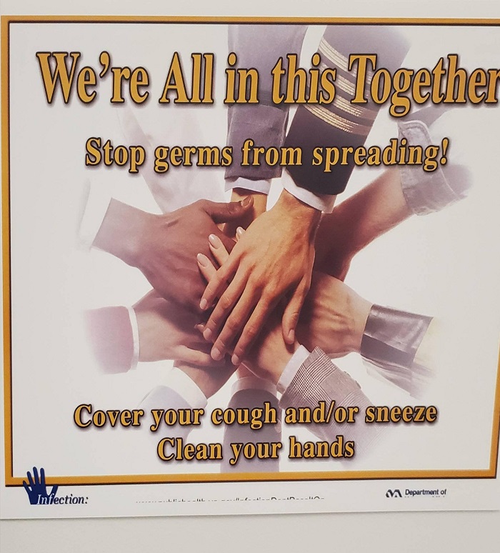
4. This hygiene poster
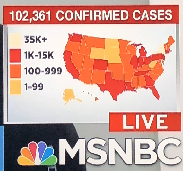
5. The colour key on this coronavirus map that makes no sense
6. The hand sanitiser that looks like a drink
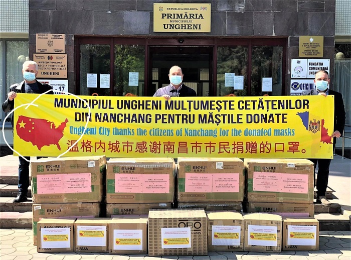
7. The Moldovan poster thanking the US for supplies from China
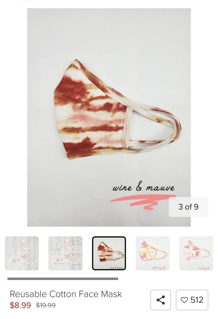
8. This face mask that looks like there’s been a terrible accident
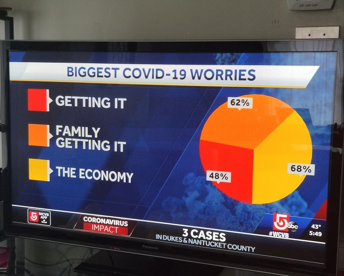
9. The pie chart with 178% of Covid worries