‘Trump’s lies’ vs ‘Obama’s lies’ are the best graphs you’ll see this week

The New York Times has plotted all of Donald Trump’s lies since he came to office, compared with all the lies told by Barack Obama up until the same point of his presidency.
And you don’t have to look too closely to see what they say.
After we published a list of Trump's lies this summer, some of his supporters asked us to compare Trump to other presidents. We've done so and just published the results: https://t.co/ivdTB7a7rN pic.twitter.com/SA0STVoXgv
— David Leonhardt (@DLeonhardt) December 14, 2017
There’s a whole load of background here and an exhaustive (and exhausting) list of every falsehood to date.
Here’s another graph we like, plotting each ‘blatant falsehood’ of the two presidents in the nearly 12 months after their inauguration.
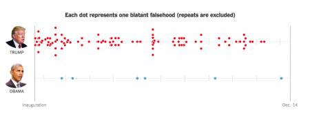
Here are the stats again, but told in a slightly different way. We like this one too.
The visual.https://t.co/sSGsxqTQ5h pic.twitter.com/dLj8r1xkMg
— #Repeal&Replace45 🌊🌊🌊♒️🐇 (@dlaquarabbit) December 14, 2017
Lots of Trump supporters weren’t happy but they have only themselves to blame. The paper only did it after it published a list of Trump’s lies in the summer and his supporters complained that previous presidents were just as bad.
Oh no they’re not! (Well, it IS that time of the year).