Low turnout to death metal gig after flyer accidentally uses same illegible font as the band’s logo

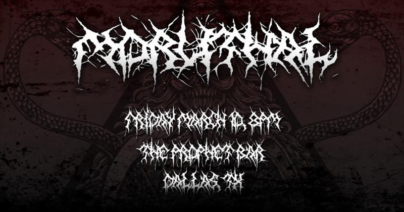
The Hard Times reports that both the flyer and the original logo font were designed by the band’s manager, Dustin Balboa.
“I think, deep down, he’s just too proud of that logo font. He went out of his way to hand-draw every letter A through Z, every number 0 through 9, and basic punctuation, even though our band name is just 8 letters,” said Moruthal bassist Randall Wu.
“I posted images of that flyer all over social media,” said Balboa. “Facebook, Instagram, Snapchat, Twitter — I hit them all. It’s not my fault these people can’t read.”
Many metal band logos are notoriously unreadable (to the uninitiated) , such as this one for the Finnish band Korgonthurus.
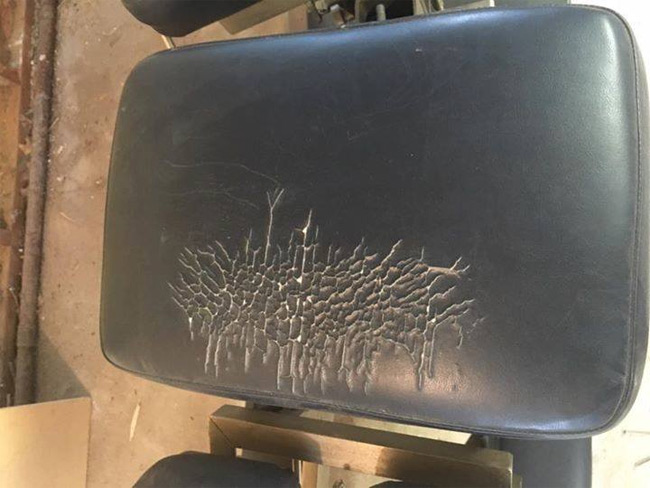
Or this band from Minsk, called Eximperituserqethhzebibšiptugakkathšulweliarzaxułum.
They apparently got inspiration for the logo from this chair.
And finally, this controversial Norwegian black metal band.