The 27 most hilarious “publishing layout” failures of all time

If you don’t laugh at a least one of these beautiful errors you’re dead inside. DEAD INSIDE we tell you.
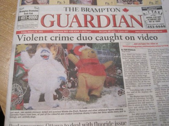
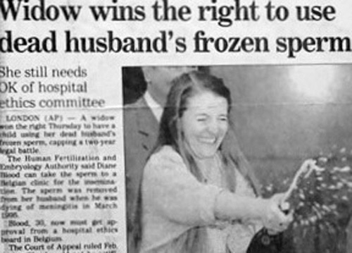
1. Pretty sure it wasn’t them…
2. When font reflections go bad…
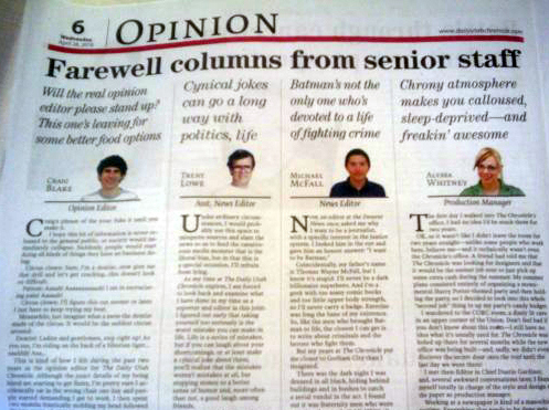
3. A Fond Farewell
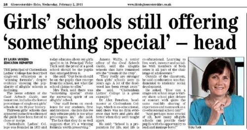
4. The abbreviation of job titles is inadvisable
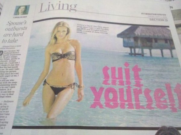
5. Readers of Where magazine could also be mislead into thinking that the cover model is not a wholesome, tourist-friendly figure, but something else entirely

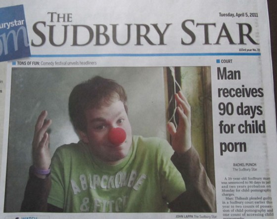
6. Un-Comic Relief
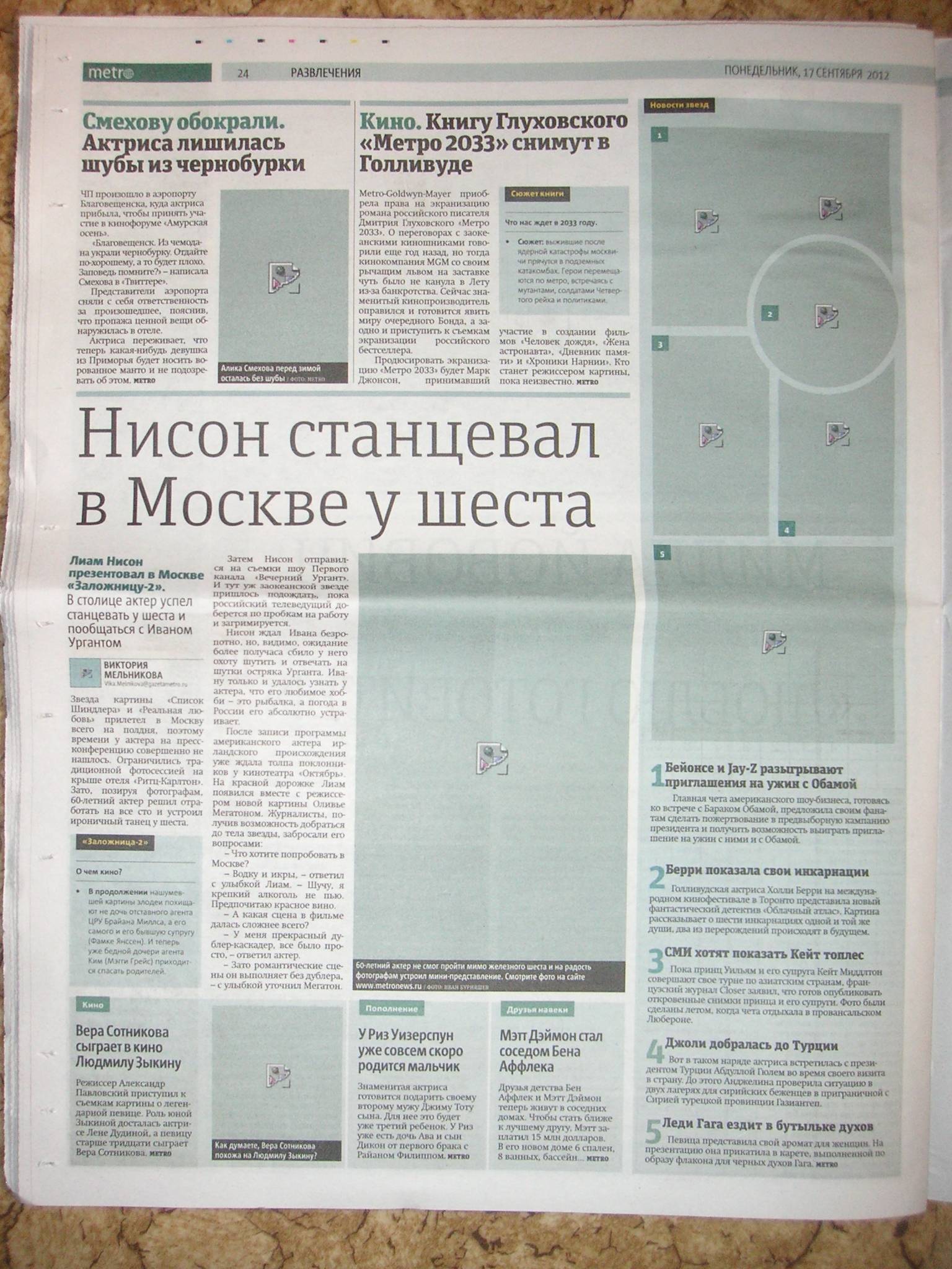
7. Russian Metro forgets to print the pictures
8. Why punctuation matters

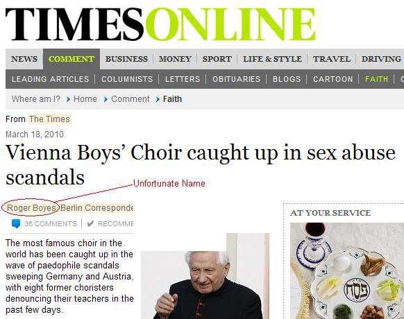
9. American rock band gets dragged into murder trial

10. The perils of web-ready copy…

11. Bowling ad fail

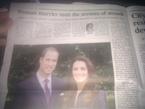
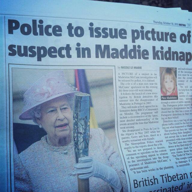
12. Bit of a downer on the Royal Wedding celebrations
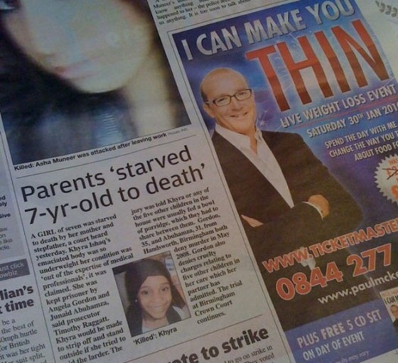
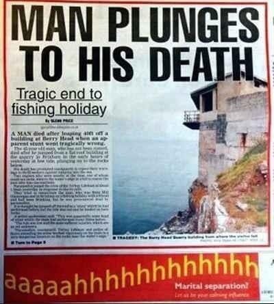
13. Hypnosis ad couldn’t be in a worse place
14. Oh lord…
15. It’s important to think about how they’ll look when they stack…

16. Bye Bye Daddy

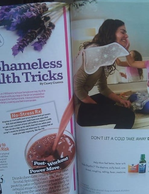
17. We do not wish to see your ‘Post work-out power move’
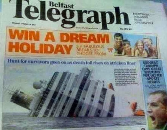
18. Dream holiday..
19. Seriously…?
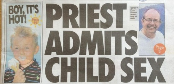
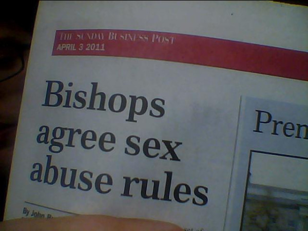
20. The perfect headline
21. Oops

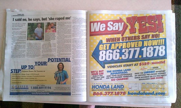
22. ‘We say YEsss’
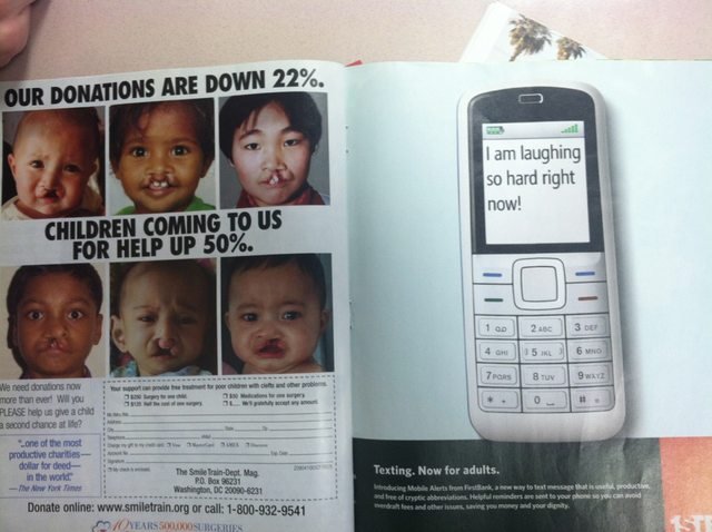
23. Prize-winning stuff..
24. The future is WHAT?

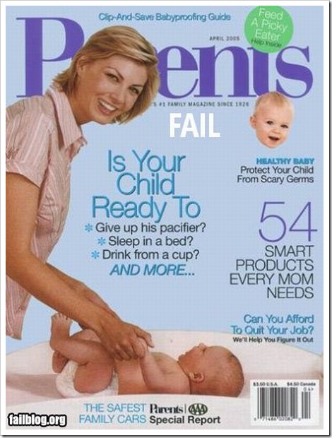
25. Parents magazine needs pay more attention to its sticker placement
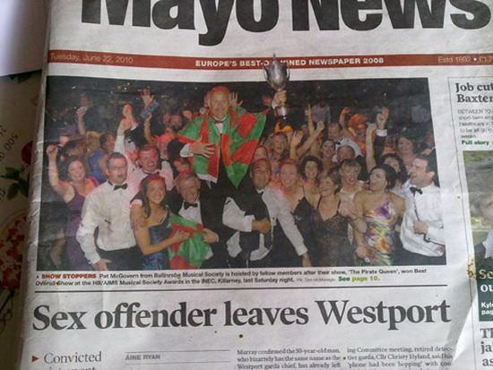
26. Hooray
27. And finally, this isn’t a fail at all, simply a perfect headline

Bonus blunders…submitted by you…
[via Steven Hopper]
[via Steven Hopper]
[via @DoctorLeeds]
[via @rrobertschwartz]