26 unfortunate publishing layouts of our time
1. Pretty sure it wasn’t them..
2. Parents magazine needs pay more attention to its sticker placement
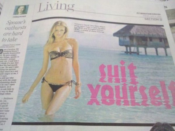
3. When font reflections go bad…
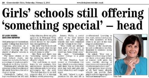
4. The abbreviation of job titles is inadvisable
5. Readers of Where magazine could also be mislead into thinking that the cover model is not a wholesome, tourist-friendly figure, but something else entirely.
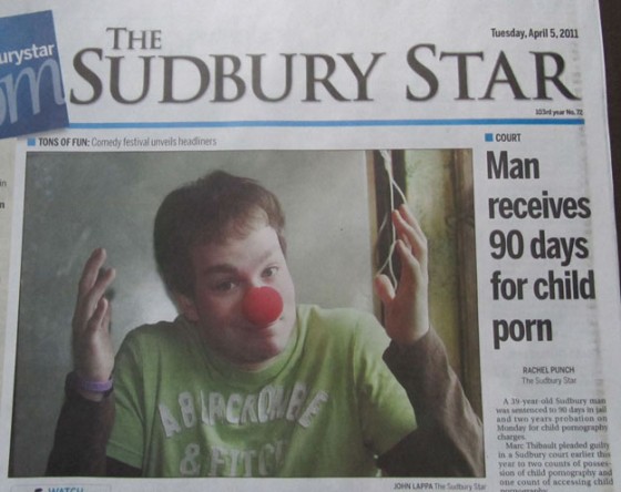
6. Un-Comic Relief
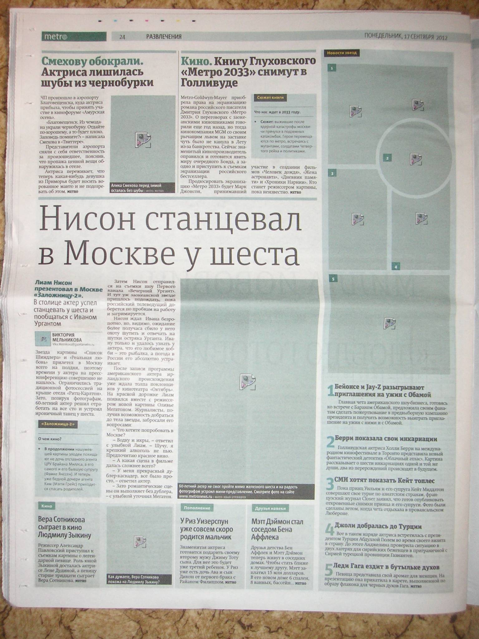
7. Russian Metro forgets to print the pictures
8. Why punctuation matters
9. American rock band gets dragged into murder trial
10. The perils of web-ready copy..
11. Bowling ad fail
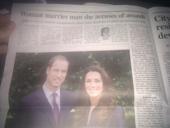
12. Bit of a downer on the Royal Wedding celebrations
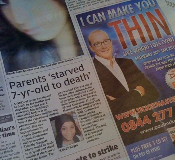
13. Hypnosis ad couldn’t be in a worse place

![cover_magazine_fail[2]](https://www.thepoke.co.uk/wp-content/uploads/2013/04/cover_magazine_fail2.jpg)
